Demystifying Web Components: Understanding Slots (Part 1)
Discover how slots in Web Components allow for flexible content insertion, improving component reusability and customization.
TL;DR
Slots are a powerful feature of Web Components that allow for flexible content insertion. They improve component reusability and customization by providing a way to insert external content into specific places in your component’s shadow DOM.
Introduction to Web Components
Web Components represent a set of web platform APIs that allow you to create reusable, encapsulated HTML tags for use in web pages and web apps. They are based on four main technologies:
- Custom Elements
- Shadow DOM
- HTML Templates
- ES Modules
Among these, the Shadow DOM plays a crucial role in enabling the use of slots, which we’ll explore in depth in this article.
What are Slots?
Slots are placeholders inside your component’s shadow DOM that allow you to insert content from the light DOM (the regular DOM) into specific places in your component’s template.
Think of slots as designated areas in your component where external content can be placed. This content can be any valid HTML, including text, other elements, or even other Web Components.
Here’s a simple analogy: imagine a greeting card with blank spaces for you to write a personal message. The card is your Web Component, and the blank spaces are the slots where you can insert your custom content.
Why Use Slots?
Slots offer several significant benefits in Web Component design:
- Flexibility: They allow you to create more versatile components that can adapt to different use cases without changing the component itself.
- Reusability: A single component can serve multiple purposes by allowing different content to be slotted in, reducing the need for multiple similar components.
- Separation of Concerns: Slots maintain a clear separation between the structure of your component and its content, making it easier to maintain and update both independently.
- Enhanced Customization: Users of your component have more control over its appearance and functionality without needing to modify the core component code.
Basic Slot Usage
Let’s explore two fundamental ways to use slots in your Web Components:
Single Unnamed Slot
The simplest use of slots is a single, unnamed slot. This acts as a general-purpose container for any content the user wants to insert into the component.
class SimpleCard extends HTMLElement {
  constructor() {
    super();
    this.attachShadow({ mode: 'open' });
    this.shadowRoot.innerHTML = `
      <style>
        .card {
          border: 1px solid #ccc;
          padding: 10px;
          margin: 10px;
        }
      </style>
      <div class="card">
        <slot></slot>
      </div>
    `;
  }
}

customElements.define('simple-card', SimpleCard);
Usage:
<simple-card>
  <h2>Welcome</h2>
  <p>This is a simple card component.</p>
</simple-card>
In this example, the <slot></slot> in the component will be replaced by the <h2> and <p> elements when the component is used.
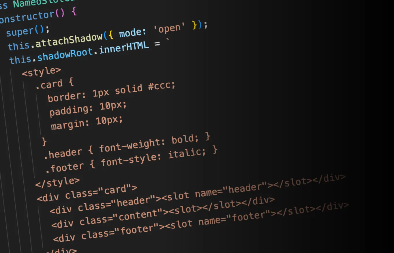
Named Slots
Named slots allow you to define multiple specific locations where content can be inserted. This gives you more control over the structure of your component.
class NamedSlotCard extends HTMLElement {
  constructor() {
    super();
    this.attachShadow({ mode: 'open' });
    this.shadowRoot.innerHTML = `
      <style>
        .card {
          border: 1px solid #ccc;
          padding: 10px;
          margin: 10px;
        }
        .header { font-weight: bold; }
        .footer { font-style: italic; }
      </style>
      <div class="card">
        <div class="header"><slot name="header"></slot></div>
        <div class="content"><slot></slot></div>
        <div class="footer"><slot name="footer"></slot></div>
      </div>
    `;
  }
}

customElements.define('named-slot-card', NamedSlotCard);
Usage:
<named-slot-card>
  <span slot="header">Card Title</span>
  <p>This is the main content of the card.</p>
  <span slot="footer">Card Footer</span>
</named-slot-card>
In this example, we define three slots: a named “header” slot, an unnamed slot for the main content, and a named “footer” slot. The content is distributed to these slots based on the slot attribute of the child elements.
Conclusion
Slots are a powerful feature that significantly enhances the flexibility and reusability of Web Components. In this article, we’ve covered the basics of what slots are, why they’re useful, and how to use them in simple scenarios.
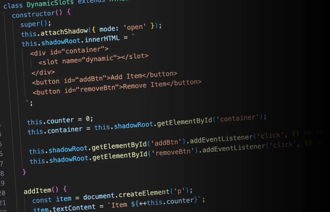
In the next part of this series, we’ll explore more advanced slot techniques, including fallback content, slot assignment, and dynamic slot manipulation. Stay tuned!