CampusIQ: Building an AI-Ready Design System for Higher Education Technology
Services Provided
Design Systems Architecture
Front-End Development
AI Workflow Integration
Industry
Higher Education Technology
Technology Used
React/TypeScript
Tailwind CSS
Figma
Storybook
Objective
To build a context-based design system that unifies three component libraries into a single AI-ready foundation, enabling consistent development across CampusIQ’s products.
Bridging the Gap Between Design and AI
CampusIQ provides AI-powered space utilization analytics for universities. After securing funding and scaling from 5 to 20 employees, they needed design consistency across two products: SpaceWalker and Space Utilization.
Their engineering team was already using AI tools like Claude Code and Cursor, but without a structured design system, AI-generated code was inconsistent. Three different component libraries across products with no shared design language or formal handoff process.
The gap wasn’t technical capability—it was contextual continuity.
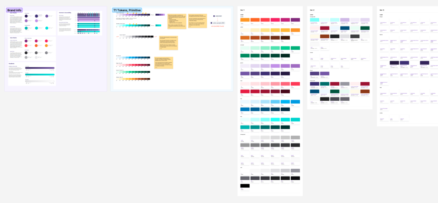
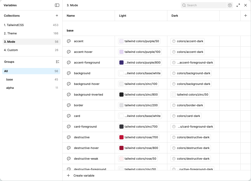
A Token-First Architecture
We built a context-based design system using shadcn/ui as the foundation, chosen specifically for its compatibility with AI workflows and modern development practices. Our design systems engineer, Murphy Trueman, worked directly with CampusIQ’s product director to build fluency in design system fundamentals and token architectures — then configured an advanced token system using CSS custom properties that powers the Tailwind CSS implementation across all products. The result: a single source of truth spanning core brand identity, semantic color scales, system-wide spacing and typography, and full dark mode support with automatic theme switching.
AI-Integrated Design Workflow
The design-to-development workflow leverages Figma Console MCP, an open-source tool we built that gives AI full awareness of the design system. Developers use Claude Code with MCP integration to analyze differences between Figma specifications and current code, understand component intent from embedded documentation, and generate implementation with full context.
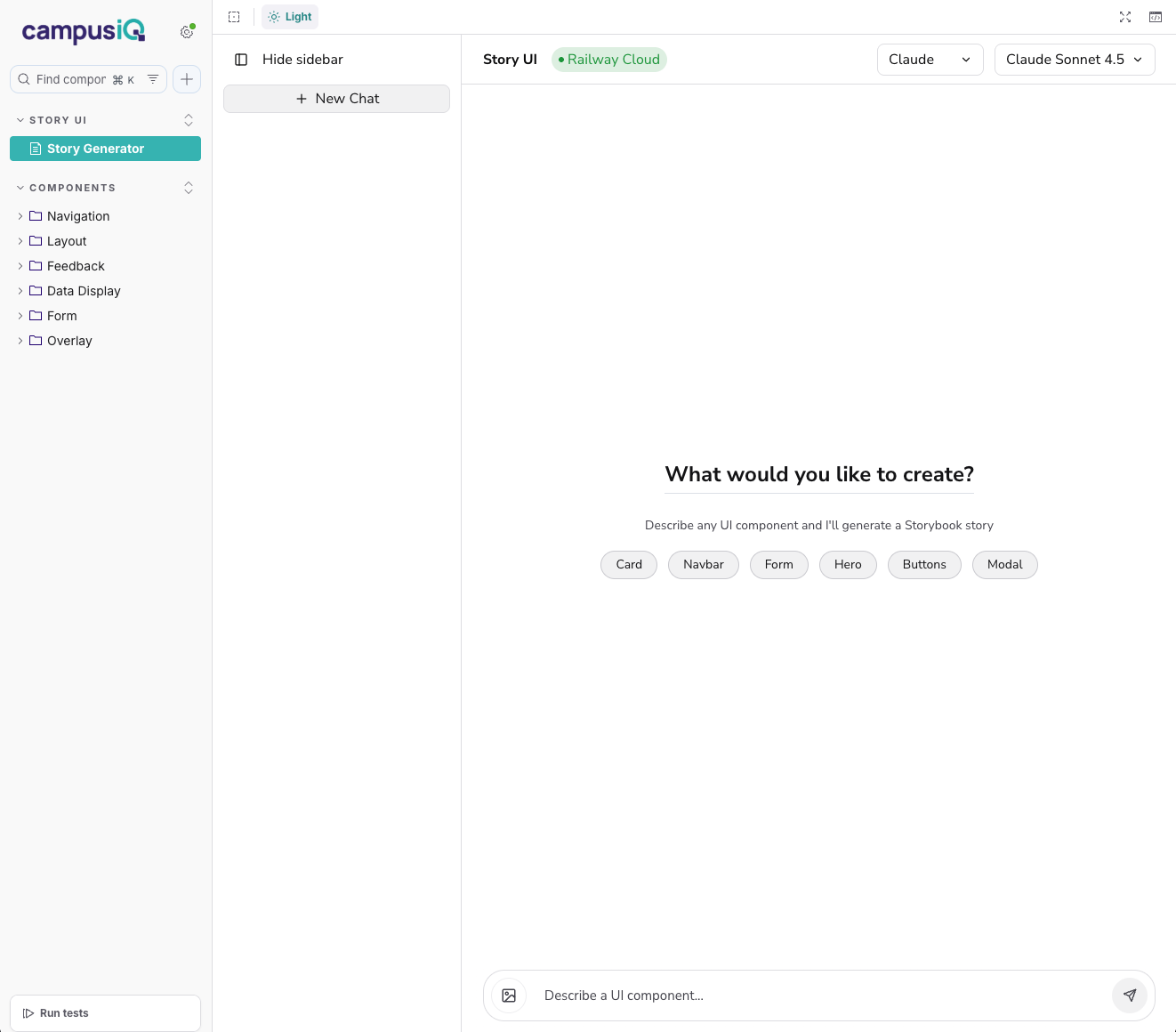
We also deployed Story UI, enabling the product team to prototype layouts using actual production components without developer involvement. It generates functional code that can be reviewed and implemented directly.
AI-Integrated Design Workflow
The design-to-development workflow leverages Figma Console MCP, an open-source tool we built that gives AI full awareness of the design system. Developers use Claude Code with MCP integration to analyze differences between Figma specifications and current code, understand component intent from embedded documentation, and generate implementation with full context.
We also deployed Story UI, enabling the product team to prototype layouts using actual production components without developer involvement. It generates functional code that can be reviewed and implemented directly.
Components Built for Scale
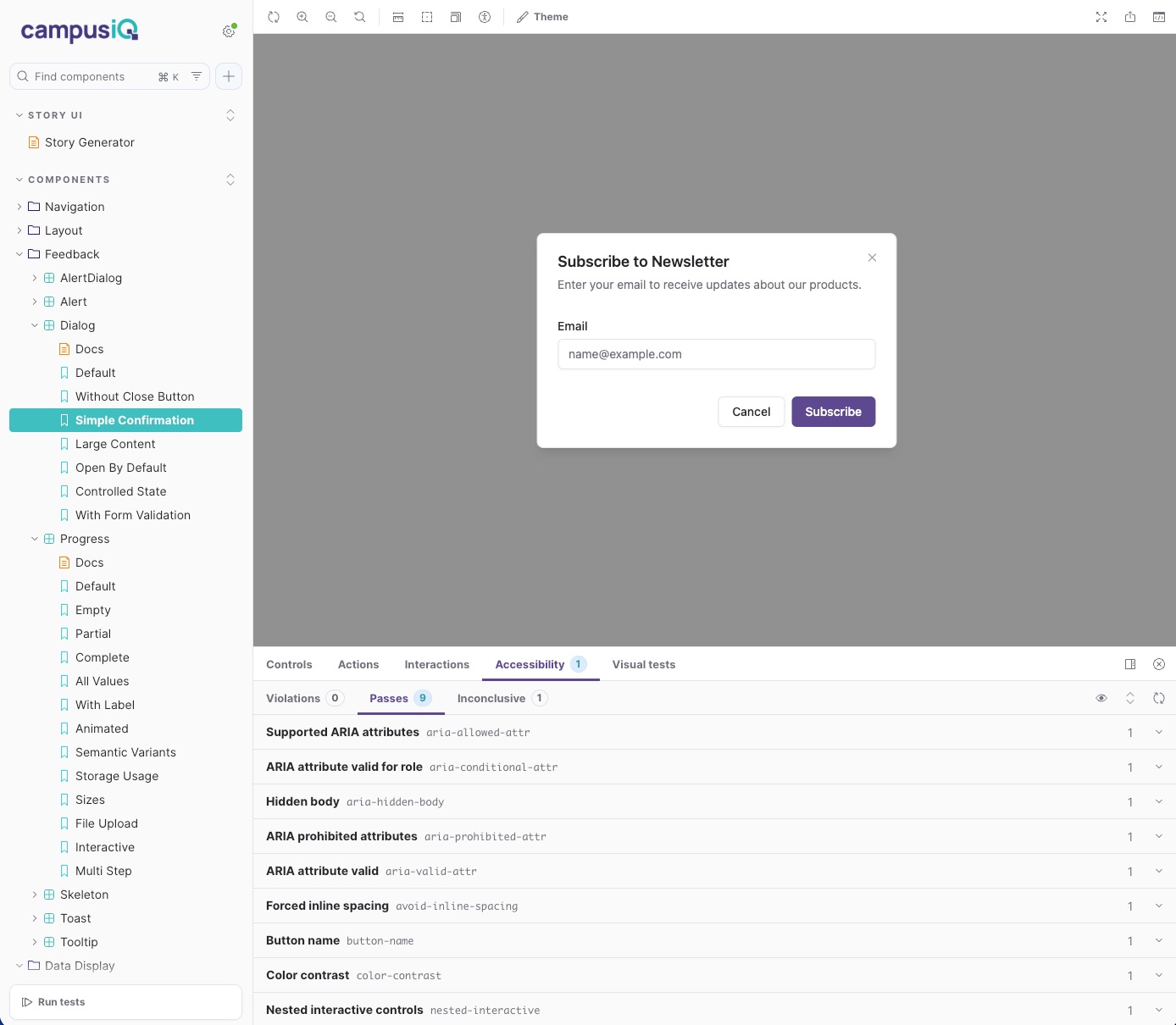
The production component library delivers 50+ components built with React 19, TypeScript, and Tailwind CSS v4 — covering forms, navigation, feedback, and data display. Every component includes semantic color variants for success, warning, and destructive states, complete dark mode implementation, and WCAG 2.1 AA compliance. Interactive Storybook documentation provides live examples for every component state and variant.


Accessibility as Foundation
Every component in the system meets WCAG 2.1 AA standards. Accessibility is not a checklist item — it is embedded in the component architecture through semantic markup, keyboard navigation patterns, and ARIA attributes.
The Dialog component demonstrates this approach: each interaction pattern is validated against accessibility guidelines before entering the production library. Focus management, screen reader announcements, and escape key handling are built into the component core behavior.

The Impact
The design system established contextual continuity that did not exist before. The product director now validates layouts independently through Story UI. The development team generates consistent, on-brand implementations through AI tools that understand design intent. What previously required hours of back-and-forth now happens in minutes.
The token-first architecture means CampusIQ can adapt or migrate component libraries without rebuilding their design foundation. As they continue building SpaceWalker and Space Utilization, new components integrate immediately across all products through AI-aware workflows. The governance structure ensures design quality while development velocity increases.
Context as Currency
This engagement demonstrates what becomes possible when design systems carry meaning and intent, not just visual specifications. By embedding purpose, interaction behavior, and accessibility guidance directly into components, the system becomes infrastructure that scales with AI-driven workflows. CampusIQ now has a model for how lean teams achieve enterprise-quality consistency while maintaining rapid development velocity.