Building Multi-Brand Design Systems: The Developer’s Perspective

Design systems are powerful. They unify teams, streamline development, and keep your product experience consistent across brands. But let’s be real—design systems aren’t just about pretty colors and perfectly aligned buttons. For developers, they’re about creating flexible, scalable codebases that work as hard as we do.
At their best, design systems are the secret sauce to a successful front-end workflow. At their worst, they’re a mess of disconnected ideas, a tangled web of tools, and a headache to maintain. The difference? Intention and strategy.
Here’s how we approach building multi-brand design systems focusing on technology, flexibility, and delivering real-world value.
Start With the Basics, But Don’t Stay There
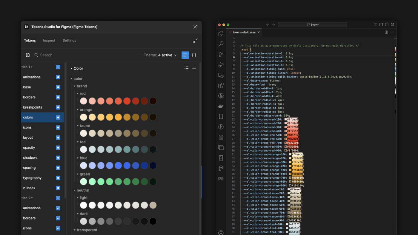
Every design system begins with tokens—those little pieces of data that describe everything from colors and typography to spacing and animations. Tokens are the first step in bridging the gap between design and code. They’re abstract but critical, setting the groundwork for consistency.

But here’s where developers come in: we don’t just copy and paste color values from a design file. Tools like Style Dictionary and Token Studio for Figma make it easy to create tokens that are more than a static list—they’re dynamic, platform-agnostic, and ready for anything.
By defining tokens semantically—think primary-button-bg instead of blue-500—we create a system that can handle anything from dark mode to an entirely new brand palette without breaking a sweat.
Turning Tokens Into Reality
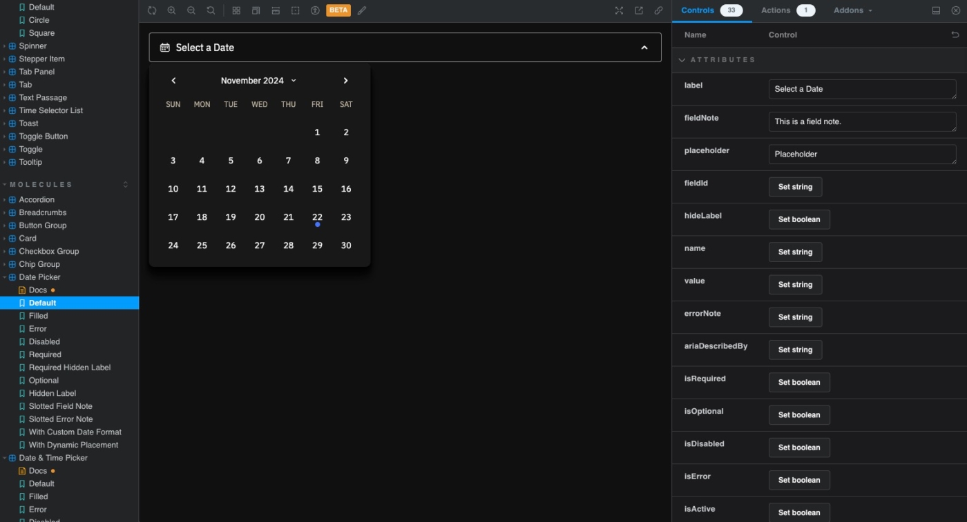
Tokens are great, but they’re just data. The real magic happens when they come to life in components. For us, this starts in Storybook. It’s the developer’s playground, where we can build, test, and document components in isolation before they ever make it into an application.

But components aren’t just about coding up buttons or inputs. They’re about creating a living library of reusable, accessible building blocks that are powered by tokens. This tight connection ensures that a single update—say, a new brand color or a tweaked spacing rule—flows seamlessly through every component.
Storybook also acts as a bridge between teams. Designers can see how their work translates to code, and developers can get instant feedback. It’s where collaboration gets real.
Theming Without the Headaches
One of the biggest challenges in a multi-brand design system is making it flexible enough to handle themes, modes, and entirely different brand identities. Here’s where tokens pull their weight.
With the right setup, tokens can define everything from light and dark modes to brand-specific variations. For developers, CSS custom properties and JavaScript theming libraries like Styled Components make it possible to apply these tokens dynamically. This way, we’re not duplicating code or maintaining multiple versions of the same component.
The result? A system that can switch between brands as easily as flipping a switch.
Shipping It to the World
A design system isn’t complete until it’s in the hands of developers building real products. Packaging components and tokens for production are often where things fall apart, but they don’t have to.
We use tools like Rollup or Webpack to bundle components into libraries that can be published to a private NPM registry. This ensures that every product team has access to the latest and greatest version of the system. No more copy-pasting components from one project to another.
Tokens, too, are delivered as code—whether it’s JSON, CSS variables, or something more custom. They’re not just files sitting in a repository; they’re integrated directly into the build process, so updates are seamless and automatic.
Bringing It All Together
Here’s the thing: building a multi-brand design system isn’t just about tools or workflows. It’s about aligning design and development in a way that feels natural and collaborative. When designers and developers are in sync, the results speak for themselves: products ship faster, inconsistencies disappear, and brands shine.
For us, it’s not just about the process—it’s about creating something that scales, something that adapts, and something that works as hard as we do.
And while every design system looks different, the principles remain the same: stay intentional, focus on flexibility, and never lose sight of the real goal—delivering better products to users, faster.
So, whether you’re starting with a blank slate or wrangling an existing system into something cohesive, the approach is the same: build it smart, build it scalable, and build it for the people who’ll use it—on both sides of the screen.
