Taming the Shadow DOM: Injecting Global Styles with Adopted Stylesheets
Achieve a unified look for your web application! Learn how to bridge the gap between web components’ Shadow DOM and global styles using the power of adopted stylesheets.
Web components have revolutionized how we build modular, maintainable web applications. Their crown jewel, the Shadow DOM, guarantees style encapsulation. Yet, the quest for global styling consistency remains a challenge. Can we have reusable utility and object-oriented classes like .u-position-relative seamlessly work within our web components and the overall application? This article dives into using adopted stylesheets to bridge the gap between the Shadow DOM and global styles.
Understanding the Shadow DOM
Think of the Shadow DOM as a shield protecting your web component’s internal styles and markup from the rest of the document. While this isolation is excellent for modularity, it makes sharing common utility classes a bit tricky.
Adopted Stylesheets to the Rescue
Enter adopted stylesheets, a relatively new browser feature. They let you create a CSSStyleSheet object that can be adopted by multiple shadow roots or even the main document. Sharing styles become efficient, avoiding duplication and streamlining theming.
Example
<!-- index.html -->

<!DOCTYPE html>
<html>
<head>
  <title>My App</title>
  <style type='text/css' id='my-theme-sheet'>
    .u-position-relative {
      position: relative;
    }
  </style>
  <script src="button.js"></script>
</head>
<body>
  <my-button></my-button>
</body>
</html>
// button.js
class MyButton extends HTMLElement {
constructor() {
super();
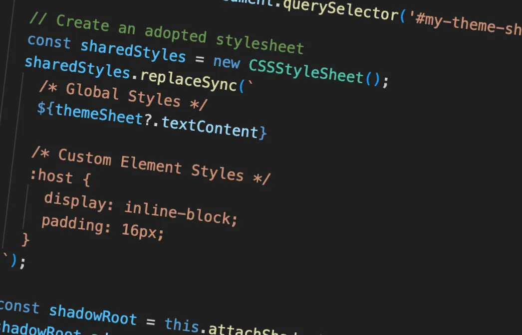
// Find global stylesheet
const themeSheet = document.querySelector('#my-theme-sheet');
// Create an adopted stylesheet
const sharedStyles = new CSSStyleSheet();
sharedStyles.replaceSync(`
/* Global Styles */
${themeSheet?.textContent}
/* Custom Element Styles */
:host {
display: inline-block;
padding: 16px;
}
`);
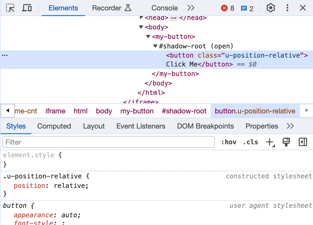
const shadowRoot = this.attachShadow({mode: 'open'});
shadowRoot.adoptedStyleSheets = [sharedStyles];
// Add button element
const button = document.createElement("button");
button.textContent = "Click Me";
button.classList.add('u-position-relative'); // Use the utility class
shadowRoot.appendChild(button);
}
}
customElements.define('my-button', MyButton);And magically we have shared utility classes!
Considerations
- Inline Stylesheets: For easy adoption, inline your utility styles within
<style>tags in your HTML. - No
@import: Using@importwithin adopted stylesheets may cause issues.
Conclusion
The Shadow DOM is a fantastic tool for web component encapsulation. With adopted stylesheets, you can inject global styles for a consistent look and feel, making them integrate effortlessly into your application’s design system.