Demystifying Web Components: Understanding Slots (Part 4)
Master advanced styling techniques for slotted elements, focusing on CSS custom properties and targeting specific elements to create highly flexible and themeable Web Components.
TL;DR
This article deep dives into advanced styling techniques for slotted elements in Web Components, with a focus on CSS custom properties and various methods to target specific slotted elements. These techniques enable highly customizable and flexible component designs.
Introduction
In Part 3 of our series, we touched on some basic styling techniques for slotted content. In this final installment, we’ll explore more advanced styling methods, with a particular emphasis on CSS custom properties and targeting specific slotted elements.
The Power of CSS Custom Properties in Web Components
CSS custom properties (also known as CSS variables) are a game-changer for styling Web Components, especially when dealing with slotted content. They allow for a level of customization and flexibility that wasn’t possible before.
Why CSS Custom Properties are Crucial
- They cross the shadow DOM boundary: Unlike regular CSS properties, custom properties are inherited through the shadow DOM, allowing for easy theming of components.
- They enable runtime changes: You can modify custom properties dynamically with JavaScript, allowing for real-time style updates.
- They provide a clear API for styling: By exposing custom properties, you give users of your component a clear and controlled way to customize its appearance.
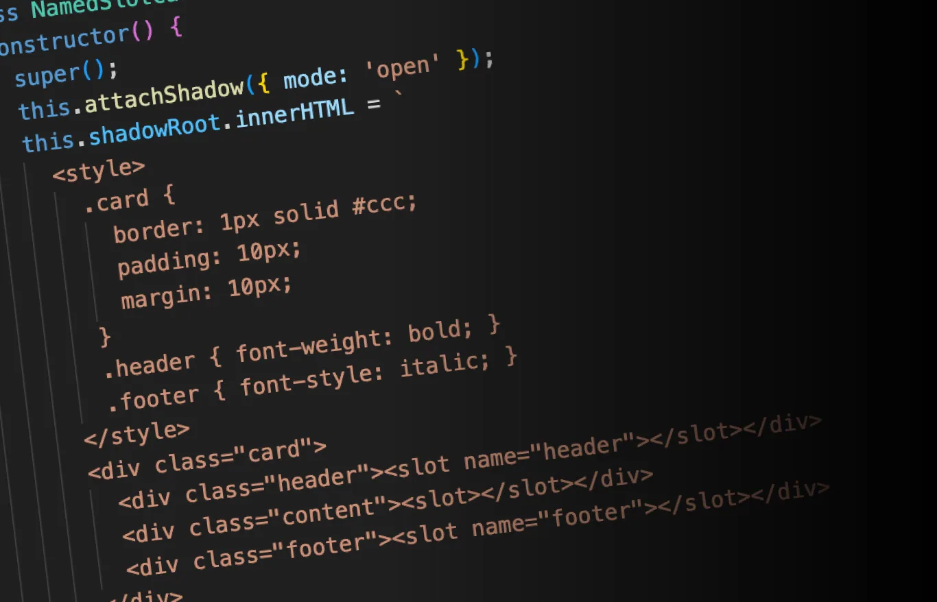
Example: A Themeable Card Component
Let’s create a card component that uses CSS custom properties for styling:
class ThemeableCard extends HTMLElement {
  constructor() {
    super();
    this.attachShadow({ mode: 'open' });
    this.shadowRoot.innerHTML = `
      <style>
        :host {
          --card-bg-color: #ffffff;
          --card-text-color: #000000;
          --card-padding: 16px;
          --card-border-radius: 8px;
        }
        .card {
          background-color: var(--card-bg-color);
          color: var(--card-text-color);
          padding: var(--card-padding);
          border-radius: var(--card-border-radius);
          box-shadow: 0 2px 4px rgba(0,0,0,0.1);
        }
      </style>
      <div class="card">
        <slot name="header"></slot>
        <slot></slot>
        <slot name="footer"></slot>
      </div>
    `;
  }
}

customElements.define('themeable-card', ThemeableCard);
Usage:
<style>
  .dark-theme {
    --card-bg-color: #2c3e50;
    --card-text-color: #ecf0f1;
    --card-padding: 24px;
    --card-border-radius: 16px;
  }
</style>

<themeable-card>
  <h2 slot="header">Default Theme</h2>
  <p>This card uses the default theme.</p>
</themeable-card>

<themeable-card class="dark-theme">
  <h2 slot="header">Dark Theme</h2>
  <p>This card uses a custom dark theme.</p>
</themeable-card>
Targeting Specific Slotted Elements
While the ::slotted() pseudo-element is powerful, it has limitations. Let’s explore various techniques to target and style specific slotted elements.
1. Using ::slotted() with Specific Selectors
The ::slotted() pseudo-element can take a selector as an argument, allowing you to target specific slotted elements:
::slotted(h2) {
  color: blue;
}

::slotted(.important) {
  font-weight: bold;
}
2. Combining ::slotted() with Named Slots
You can combine ::slotted() with named slots to target elements in specific slots:
::slotted([slot="header"]) {
font-size: 1.5em;
border-bottom: 1px solid #ccc;
}
::slotted([slot="footer"]) {
font-style: italic;
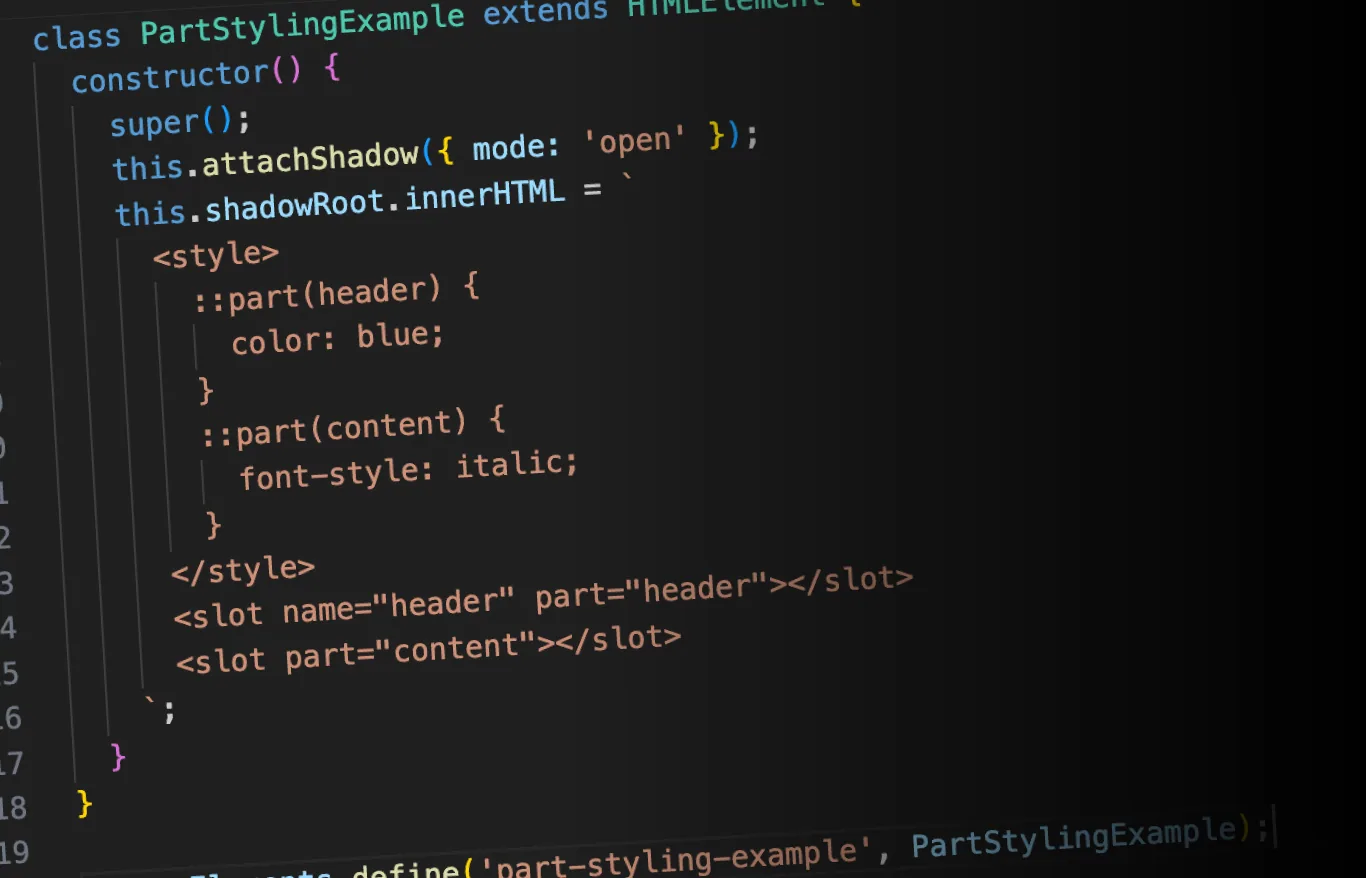
}3. Using Part Attributes
The ::part() pseudo-element allows you to style elements within the shadow DOM that have a part attribute. This can be useful for styling specific parts of complex slotted content:
class PartStylingExample extends HTMLElement {
  constructor() {
    super();
    this.attachShadow({ mode: 'open' });
    this.shadowRoot.innerHTML = `
      <style>
        ::part(header) {
          color: blue;
        }
        ::part(content) {
          font-style: italic;
        }
      </style>
      <slot name="header" part="header"></slot>
      <slot part="content"></slot>
    `;
  }
}

customElements.define('part-styling-example', PartStylingExample);
Usage:
<part-styling-example>
<h2 slot="header">This header will be blue</h2>
<p>This content will be italic</p>
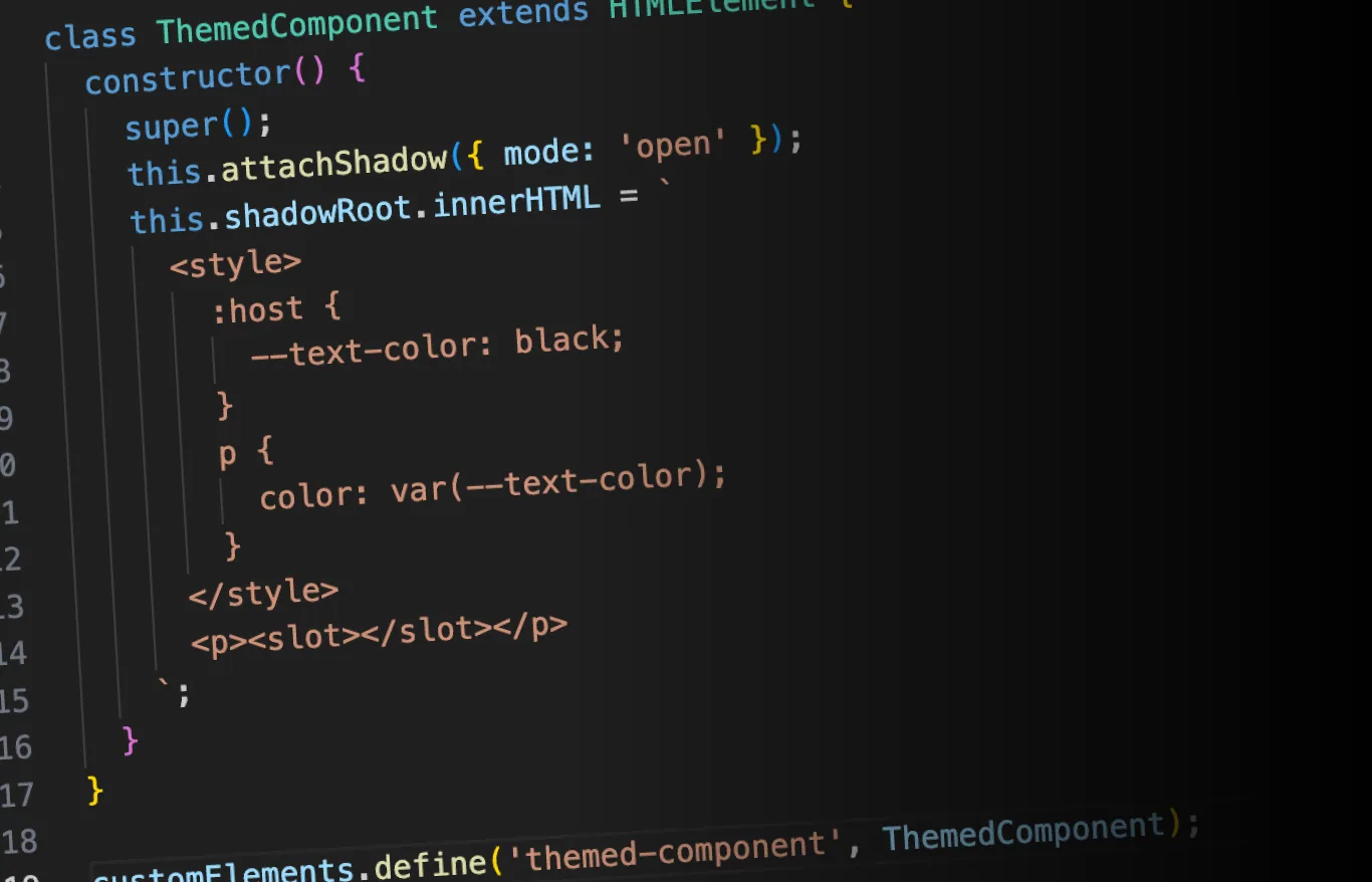
</part-styling-example>4. Contextual Styling with CSS Custom Properties
You can use CSS custom properties to apply contextual styling to slotted elements:
class ContextualStyling extends HTMLElement {
  constructor() {
    super();
    this.attachShadow({ mode: 'open' });
    this.shadowRoot.innerHTML = `
      <style>
        :host {
          --slotted-color: black;
        }
        ::slotted(*) {
          color: var(--slotted-color);
        }
      </style>
      <slot></slot>
    `;
  }
}

customElements.define('contextual-styling', ContextualStyling);
Usage:
<style>
  contextual-styling.warning {
    --slotted-color: red;
  }
</style>

<contextual-styling>
  <p>This text will be black</p>
</contextual-styling>

<contextual-styling class="warning">
  <p>This text will be red</p>
</contextual-styling>
Best Practices for Styling Slotted Elements
- Use CSS Custom Properties for Theming: Expose key style properties as CSS custom properties to allow easy customization.
- Provide Sensible Defaults: Always set default values for your custom properties to ensure your component looks good out of the box.
- Use Specific Selectors: When using
::slotted(), be as specific as possible to avoid unintended styling effects. - Consider Using Parts: For complex components, consider using the
partattribute and::part()pseudo-element for more granular styling control. - Document Your Styling API: Clearly document which CSS custom properties and parts are available for styling, so users of your component know how to customize it.
- Be Mindful of Specificity: Remember that styles in the light DOM can override
::slotted()styles. Design your styling API with this in mind.
Conclusion
Mastering the styling of slotted elements is crucial for creating flexible and customizable Web Components. By leveraging CSS custom properties, understanding the nuances of ::slotted(), and utilizing techniques like parts, you can create components that are both powerful and easy to style.
Remember, the goal is to create components that are not only functional but also adaptable to various design systems and user preferences. With these advanced styling techniques, you’re well-equipped to create Web Components that can seamlessly integrate into any project.
This concludes our series on understanding slots in Web Components. We hope you’ve gained a comprehensive understanding of how to use and style slots effectively in your Web Component development journey!