Create Impressive Scroll-Based Animations with CSS scroll-timeline
Learn how to create immersive scroll-based animations based on user scrolling with no JavaScript required.
In a recent video, front-end web developer and instructor Kevin Powell covered how to create unique scroll-based animations using the CSS scroll-timeline feature. This powerful capability allows developers to tie animations to a user’s scroll position without any JavaScript. In this article, we’ll summarize Kevin’s video and share some key code snippets for implementing scroll timelines.
What is CSS scroll-timeline?
The scroll-timeline feature lets you define animations that are controlled by the scrollbar position rather than time. As users scroll down a page, elements can fade in, slide horizontally, scale up, and more based on how far down they have scrolled. Full browser support isn’t available yet, but can be enabled via Chrome’s experimental flags feature. There is a polyfill available as well.
Key Things We Can Do with scroll-timeline:
- Fade in images as they enter and exit the viewport
- Create horizontal parallax scrolling effects
- Animate elements when they become visible in the scroll viewport
- Add fun scroll watchers that react to scrolling
Fade In Images on Scroll
Here’s an example of how to fade in images as they scroll into view:
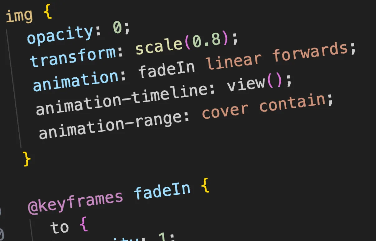
img {
  opacity: 0;
  transform: scale(0.8);
  animation: fadeIn linear forwards;
  animation-timeline: view();
  animation-range: cover contain;
}

@keyframes fadeIn {
  to {
    opacity: 1;
    transform: scale(1);
  }
}
The key points:
animation-timeline: view()– Starts when visible, finishes when no longer visibleanimation-range: cover contain– Starts as soon as its top edge enters and finishes once its bottom edge has fully scrolled into view- Forwards fill mode to remain opacity 1 at the end
See the Pen Animation Timeline Demo: Fade In Images on Scroll by TJ Pitre (@tpitre) on CodePen.
Horizontal Parallax Scrolling
Creating horizontal movement tied to vertical scrolling helps lead the viewer’s eye.
.parallax-images {
  display: flex;
}

img {
  min-width: 100vw;
  display: block;

  transform: translateX(0);
  animation: shift linear forwards;
  animation-timeline: scroll(root block);
  animation-range: cover contain;
}

@keyframes shift {
  to {
    transform: translateX(-200vw);
  }
}
The key aspects:
- Flex container allows horizontal scrolling of images
- Images are min-width of 100vw so total width extends past viewport
- shift animation translates images -200vw (2x viewport) on vertical scroll
animation-timeline: scroll(root block)– ties X animation to vertical Y scrollanimation-range: cover contain– starts animation when image enters viewport, finishes when whole image has entered- Forwards fill mode keeps the translated position at the end
See the Pen Animation Timeline Demo: Horizontal Parallax Scrolling by TJ Pitre (@tpitre) on CodePen.
Browser Support and Polyfill
Browser support isn’t there just yet. Scroll timeline has good support in Chromium browsers but requires prefixes in Firefox for now. A JavaScript polyfill handles most features but has some animation range limitations. Feature queries and progressive enhancement help handle missing support.
Conclusion
The CSS scroll-timeline feature opens up creative possibilities for scroll-based animations without JavaScript. There are still browser inconsistencies but solutions exist for handling those. As support improves, expect to see innovative uses of this capability.
More Reading
- Animate elements on scroll with Scroll-driven animations (Chrome for Developers)
- Scroll-driven Animations Demos
- Scroll-driven Animations Spec (W3C)