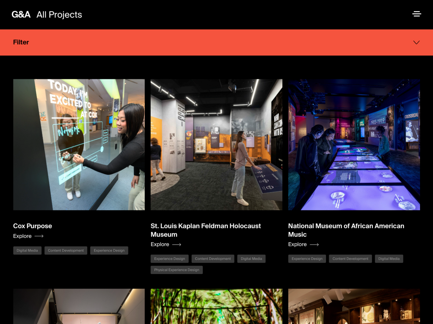
Gallagher and Associates – The Intersection of Art and Technology
The Digital Canvas Entrusted to Us
Southleft was hired to build a marketing platform for Gallagher and Associates, a globally renowned Museum Planning and Design Firm. The digital space aims to showcase their art installations, team, and services, while also serving as a hub for potential clients and collaborators.
Crafting Harmony Between Design and Functionality
Our journey began in collaboration with design experts Cycymymy. Their visual ingenuity set the stage, but the real challenge was transforming their complex artistic vision into a functional and accessible digital experience. This required intricate animations needing precise calibration and avant-garde visual elements that called for open, informed discussions to balance style and web best practices.
In essence, our traditional workflow was specially tailored in the areas of Quality Assurance and consultation to meet the project’s unique design and accessibility requirements. For example, our iterative QA cycles with Cycymymy were more frequent and detail-oriented than usual. Internally, the Southleft team thrived in a collaborative environment, sharing challenges and brainstorming solutions for complex, unconventional puzzles.

“They express a real willingness to partner and solve creative problems efficiently.
”
The Process:
- Iterative Development: Our phased approach allowed for the gradual construction of components and pages, closely aligned with design plans.
- Quality Assurance: Given Cycymymy’s flair for visual innovation, our thorough QA sessions were even more crucial than usual. Their detailed feedback ensured pixel-perfect fidelity in the final product.
- Accessibility Advocacy: With accessibility a cornerstone for Southleft, we were able to add to constructive dialogues about design choices like color contrasts, leading to refinements that met universal standards.
- Animation Integration: Using optimized CSS and JavaScript, we meticulously crafted Cycymymy’s intended animations to enhance the user experience without affecting load times.

The Outcome: A Tapestry of Digital Artistry
The result was a seamless blend of art and technology. The platform not only highlighted Gallagher’s impressive portfolio but also provided an immersive user experience. Key features included:
- Dynamic Animations: Ranging from logos morphing into navigational elements to nuanced hover states, the animations enriched the user interface without compromising performance.
- Responsive Design: Despite the unusual design and code complexity, image aspect ratios and alignments remained consistent across various devices, even in the most unique circumstances.
- Accessibility: Design elements were carefully considered and crafted to meet accessibility standards, making the site inclusive for all users.
Reflections on the Journey: A Fulfilling Creative Expedition
This project was a labor of love that required keen attention to detail. The challenges were numerous, but the rewards were equally gratifying. Our specialized expertise in front-end consultation and collaboration set us apart from other development firms. We provided informed design advice, worked effectively with our partners, and ensured the final product was both visually stunning and universally accessible.
The Gallagher project was a journey of shared creativity, innovation, and complex problem-solving. While the design challenges were daunting, they also inspired inventive solutions. The end product serves as a testament to the collective craftsmanship of Southleft and Cycymymy, showcasing what can be achieved when art and technology intersect.


The final product is a visually captivating digital space that makes no compromises on accessibility. It includes unique features like Lottie animations and intricate CSS effects, such as a zoom logo effect that posed an unexpected challenge (kudos to Greg for the ingenious solution). The site embodies Gallagher and Associates’ brand ethos and stands as a fully accessible digital entity, meeting both aesthetic and functional standards.