Introducing Story UI: Accelerating Layout Generation with AI + MCP

Over the years of working with design systems and digital product teams, one of the recurring pain points we’ve seen is the inability for non-developers to autonomously create or test page layouts. In design systems work, we often refer to these as “recipes” – unique compositions built using existing components.
These recipes might be as simple as a card carousel with a heading, subtext, and a button, or as complex as an inventory dashboard or a job search interface. While critical to product delivery, they often live on the edges of the design system, not in the core library.
In many organizations, the engineers maintaining a design system are already overloaded, editing existing components, building new ones, and managing roadmap priorities. So when a designer, PM, or other non-dev requests a layout variation, it often gets deprioritized, or worse, never shipped.
As someone who’s spent a career sitting in the space between design and development, I’ve seen this problem come up time and time again. At Southleft, we’ve made it our mission to help close that gap, and recently, thanks to advances in AI tooling and Model Context Protocol (MCP), it feels like we’re finally overlapping those disciplines, not just connecting them.
The Spark Behind Story UI
For the better part of this year, we’ve been experimenting heavily with MCP in general, and most recently with the official Figma MCP server since its release a few weeks ago. We’ve now fully adopted it across a number of projects, and it’s playing a major role in how we approach design-to-dev workflows.
That said, there was still a missing piece on the product side of the lifecycle. While MCP + AI closes the gap between design and development, the gap between development and production, where PMs and designers want to experiment and iterate, was still friction-heavy.
So we built Story UI.

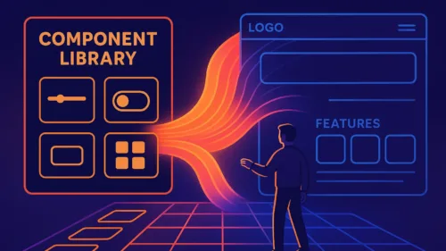
Story UI allows non-developers to generate production-ready layouts via natural language, using the real components from your design system. Behind the scenes, it leverages:
- Your existing React-based Storybook instance
- A local MCP server (Storybook is effectively acting as the code-side MCP)
- A Claude-powered AI agent to interpret prompts and generate structured layout stories
The result? Anyone can prompt the system to “generate a 3×3 grid of cards” or something more abstract like “an inventory dashboard,” and watch a layout come to life in Storybook.
How It Works
- You install Story UI from npm and run the CLI setup
- It spins up a local MCP server and your existing Storybook instance
- You select a Claude model (via API key) and optionally choose a design system (MUI, Ant, Chakra, or your custom one)
- The Story UI panel appears in Storybook with a chat-based interface
- Prompts like “generate a settings page with user profile and toggles” will create new stories under a
Generatedsection
Once a story is generated, you can iterate on it directly in the interface, adjust structure, components, or layout, all via natural language.
Story UI was originally built for our internal system, Altitude, but we’ve now generalized it to work across multiple design systems. If you’re working with Storybook and React, this should be plug-and-play with only minor config.
Where This Came From
Story UI is a direct continuation of the work we’ve been sharing over the past few months across LinkedIn and the Southleft Insights blog. We’ve been deeply involved in the early exploration of AI-assisted workflows using MCP, agentic editors like Cursor and Claude, and structured design systems. Story UI represents the next natural step in that journey.
Why This Matters
This solves a long-standing bottleneck: layout iteration for non-devs.
Instead of:
“Hey, can you build this layout for me real quick?”
You now get:
“I prompted Story UI and got something close, can you help polish it?”
This is real acceleration, especially for enterprise-style UIs, where page structures can be dense and component reuse is high.
🎥 Watch the demo:
Ready to Try It?
The repo is open and available here: https://github.com/southleft/story-ui
Please note: this is still early and actively being refined. We use it internally, so it’s stable for our setups, but we expect hiccups as others start plugging it into their own environments.
If you run into bugs, feel free to open an issue in the repo, or contribute a fix directly.
Want Help Integrating It?
Story UI is built to be flexible, but if your team is looking to go deeper, that’s where we come in.
At Southleft, we specialize in front-end engineering, design system architecture, and increasingly, AI-powered development tooling. We offer:
- Custom setup and integration support for Story UI
- Workshops to help your team build AI-ready design systems
- Ongoing engineering support and consulting for enterprise UI platforms
If you’re ready to explore what AI tooling can do inside your workflow, let’s talk.
Story UI is a big step toward democratizing layout creation inside design systems. Combined with the power of Figma MCP, it offers one of the clearest breakthroughs we’ve seen in the development-to-product workflow in years.
Have fun with it. Experiment. And if you build something cool, please share it.
—TJ