The Value of Design Tokens in Modern Web Development

Have you ever faced the daunting task of changing a website’s primary color across countless pages and elements? Without a centralized system, it’s a recipe for errors and wasted time. This is where design tokens shine. In this article, we’ll dive into design tokens, their transformative benefits, and how they revolutionize your development workflow.
What are Design Tokens?
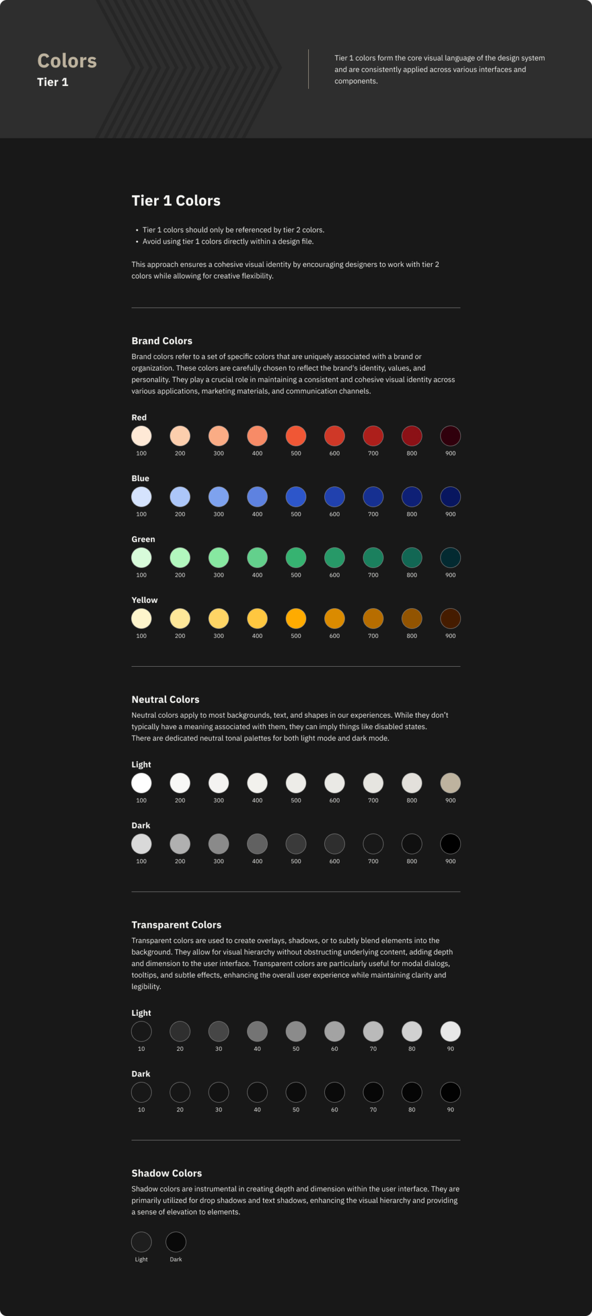
Design tokens are the atomic building blocks of a design system. Think of them as named containers that store your website’s visual DNA: colors, fonts, spacing, sizing, and more. By referencing these tokens throughout your project, you guarantee rock-solid consistency.
What are Design Tokens?
Design tokens are the atomic building blocks of a design system. Think of them as named containers that store your website’s visual DNA: colors, fonts, spacing, sizing, and more. By referencing these tokens throughout your project, you guarantee rock-solid consistency.
Why Design Tokens Matter
- Consistency: No more rogue color shades! A token like “
brand-blue” with the value “#006699” ensures that exact blue is used everywhere. This extends to spacing, typography, and more. - Maintainability: Need a design refresh? Update the token, and changes ripple through your entire application. This saves you hours of tedious work.
- Scalability: Design tokens keep your growing projects organized. New components inherit your design rules, guaranteeing a unified look.
- Collaboration: Tokens become a shared language between designers and developers– a single source of truth for your website’s style.
Tokens in Action: Web Components
Web components (reusable UI pieces) have their own styling world due to the shadow DOM. The answer? Design tokens as CSS custom properties! This lets your tokens ‘break through’ and style components from the inside.
Understanding the Shadow DOM Challenge
Web components offer amazing reusability, but their encapsulated styles (thanks to the Shadow DOM) present a challenge. Regular CSS can’t penetrate that barrier. That’s where design tokens and CSS custom properties shine!
Tokens as the Bridge
By defining your design tokens as CSS custom properties at the top level of your application, they become accessible within web components (go here for an alternative method for styling web components using adopted stylesheets). Let’s see how a tiered token structure adds flexibility:
/* Example of tokens as CSS custom properties */
:root {
  --color-brand-blue-800: #006699; /* Tier 1 */
  --theme-color-content-default: var(--color-brand-blue-800); /* Tier 2 */
  --theme-color-button-content: var(--theme-color-content-default); /* Tier 3 */
}
// my-button.js
class MyButton extends HTMLElement {
// ... your component setup
connectedCallback() {
this.shadowRoot.innerHTML = `
<style>
button {
background-color: var(--theme-color-button-content); /* Access tier 3 token */
padding: var(--spacing-base);
color: var(--theme-color-content-default);
}
</style>
<button><slot>Default Button</slot></button>
`;
}
// ... rest of your component code
}
customElements.define('my-button', MyButton);Explanation
- Tiered Structure: We define tokens at different levels of abstraction:
- Tier 1: Base value (
--color-brand-blue-800) - Tier 2: Semantic meaning (
--theme-color-content-default) - Tier 3: Component-specific use (
--theme-color-button-content)
- Tier 1: Base value (
- Within the Component: The web component’s internal styles reference the appropriate tier of tokens, inheriting values while maintaining flexibility (depending on your setup, these can be applied via your integrated stylesheets).
- Change Management: Need to update your main brand color? Modify only the top-tier token, and changes cascade down. Want to tweak buttons specifically? Adjust
--theme-color-button-contentwithout impacting other components.
Implementing Design Tokens in Your Workflow
Here’s a breakdown of how design tokens can fit into your team’s process, from concept to ongoing maintenance:
1. Design Phase: Defining Visual DNA
- Token Creation: Designers work within UI design tools such as Figma or Sketch, or other tools with design token plugins (we use Token Studio). They craft the core visual attributes:
- Color Palettes: Primary, accent, neutral tones with well-named tokens (e.g., “
brand-blue“, “error-red“). - Typography: Font families, sizes, weights, and how they apply to headings, paragraphs, etc.
- Spacing and Sizing: Consistent spacing units for margins, padding, and component sizes.
- Color Palettes: Primary, accent, neutral tones with well-named tokens (e.g., “
- Hierarchical Structure: This is where tokens become powerful! Base values (“
blue-500“) get linked to semantic uses (“accent-color“) and then to specific applications (“button-background-default“). This keeps change management easy.

2. Bridging the Gap: Exporting Your Tokens
- Tools in Play: Style Dictionary and Token Studio are your friends! They’ll turn the design file into structured data (JSON, YAML are most common).
- Version Control: Git or similar tools are key here. The exported JSON is then moved to a git repository (Token Studio takes care of this part). This lets you track token changes, roll back if needed, and helps larger teams stay coordinated.
- Bonus: Hook up a CI/CD workflow to run the Style Dictionary commands that generate the CSS or whatever style configs you’ve set.
- Naming Matters: Consistent token names from design are carried into the code, keeping everyone on the same page.
3. Development: Making it Real!
- Integration: Developers install the generated styles package via npm (or similar) and reference the tokens in their style sheets and component code. This links the design system directly to the implementation.
- Web Components: Tokens become CSS custom properties for the win! This lets your styles cascade into those encapsulated components.
- Component Library Integration: Include the generated styles in your component library environment setup (we like Storybook). This ensures visual consistency between your design system documentation and live component examples.
4. Maintenance & Evolution: Design Systems Aren’t Static
- Updates: Design changes happen. Designers update tokens directly in their tool, re-export, and Style Dictionary handles the rest. This minimizes manual updates for developers.
- Regular Review: Your system needs care. Reassess your tokens to make sure the structure and names still serve the growing project.
Beyond Implementation
Design tokens are your secret weapon for building websites that are consistent, maintainable, and effortlessly scalable. Design tokens foster collaboration and save teams valuable time. If you haven’t explored them, now’s the time to start! As web projects grow increasingly complex, particularly those relying on web components, design tokens are more than a good idea — they’re an essential tool in the modern developer’s kit.